Pages

Thursday, March 30, 2017

Long Week

    Over the past week, my patience has been spread very thin. I've been trying to begin work on my project through Microsoft Word, however it took several updates and many more Google searches to even begin working. Still, I eventually got to work on the front page of my magazine. I am unsure how to embed it directly, so I have taken a screenshot of my current progress. Of course, there is much more to come including the other two elements, but after finally getting the program working I felt like doing some blogging.

It looks a little plain right now, but I will add some cover lines, the barcode, the sell line, and other things to make it look busier and more filled out. The cover image is still a work in progress. I plan to begin taking pictures this weekend and edit them on Microsoft Paint. For the cover image, I plan on taking the pictures of the rocks painted black on a very high key white sheet of paper. Then, I am going to upload it to Paint and use the bucket tool to make the white background the same color as the magazine cover. I will zoom down to the pixel level if necessary in order to make it blend in. Then, I will add the zeros and ones with a text box in Word. 

I decided to change the font and color so that the background could be lighter and the masthead did not have to be in all caps. Also, the Cinzel font is not available on Microsoft Word. Instead, I am using Franklin Gothic Book.


Sunday, March 26, 2017

Photo List


Okey-doke, so today I created a preliminary list of pictures for my magazine. Here it is:

  1. Coal/ Rocks Painted Black (for the cover image)
  2. Transistors, and other assorted electronic items in closeup piles
  3. Kid at a computer with American/ Chinese
  4. Woman interviewed learning how to code
  5. Man in suit who wrote a book
  6. Man in suit giving presentation

Besides these pictures, I will also be providing graphics such as logos and pie- charts that will be peppered into my two-page spread and produced through Microsoft Excel or Word. In order to edit the photos above, I will be using Paint, because they won't require intensive editing and I can create the effects I need, such as tinting the mirrored images of the kid at a computer desk, by creating single colored frames and lowering the transparency so that the image behind it is effectively tinted that color. I will provide an example next week once these photos have been taken. My models for a man and women that are mentioned above will be my parents, and the transistors and other technical items I will need to photograph will be from my Dad’s supply bins. He makes vintage guitar amplifiers and has plenty of scrap wires and things that can be made to look like a technical gadget. Other images that will be in my magazine will be more difficult to produce, because I do not have Photoshop or any other versatile photo-editing or graphic design program to work with. As a result, my two-page spread will likely have large sections of text to fill up space.

Layout Attempt


Today I drew a layout for my cover page. I decided to create a central cover image of a group of rocks painted black to resemble coal. I will place it on a white paper background with high key lighting. Then, I will add zeros and ones surrounding them using a word processor. I will use a grey background, and a blue border the same color as my masthead. I have decided to include my cover stories all together at the bottom by separating it into equally allotted spaces with the bar code in the far left side.
scan0007-page-001.jpg

I have made these choices because they are within my range of capability. I am not a very artistic person, however, I can be creative with arts-and-crafts, and after seeing the very first example of a magazine cover (the puzzle pieces on a blue background), I realized creating a physical tableau and photographing it is an option for the cover. I chose not to include to many cover stories, because this would create a chaotic scene on the cover and distract from the cover image. Also, because it is a substantive magazine, the stories are generally longer and more detailed than in say, Cosmopolitan, so there are less of them in total. However, I will have to include some more titles in my table of contents. Later, I will be posting a list of photographs that I will need to gather in order to produce my project.

Tuesday, March 21, 2017

Headline Ideas

Today I started brainstorming some possible headlines in order to get working on my table of contents and cover. Because I’ve already decided on a theme, this was an expedited process. Some conventions that you will notice are inflammatory language and noticeable bias. This is not done to be disingenuous, but rather to fit the expectations of a partisan political magazine. This magazine will still go beyond the conventions of a one-sided magazine, because the target audience is more refined to professionals rather than youngsters or more casual followers of politics.

1.How Republicans Want to Drag Jobs into the Past, and Why Democrats Won’t Let Them

2.What Congress can Learn from the Atari Democrats

3.Coding: the New Coal

4.The New Space Race: Universal Tech Literacy

These are good examples, and one of them could easily become my cover story or two-page spread. I could easily see a spread using number 4. The story text would be about how imperative it is that we reach a level of tech literacy in which innovation jobs become as accessible to our citizens as manufacturing jobs. (The idea is to create a smarter workforce in industries that can’t be outsourced). It is a “space race” because we must do it before China. The images could include images like a computer lab in a school, two pictures of children at a computer using a mirror effect, one with a Chinese flag in the background and one with an American flag in the background. The rest could be text and images that are linked to portions of the text through the numbering system that I analyzed in the Atlantic article last week.

I also think that number 3 could make a good cover image. If I use this one, than I will have to use number 1 only in the table of contents, Because otherwise the lengthier headline (1) would distract from the central one (3).

Regardless of which I decide to use where, I am glad that I’m starting to have these ideas at all. In my next post, I will discuss my ideas for a cover layout and a list images I will need to capture in order to produce my magazine. I will also begin painting rocks black to look like coal.

Saturday, March 18, 2017

Inspiration Has Struck

I must admit, while I’ve certainly learned a lot about magazines over the past two weeks, I’ve been worried that my final product was still a hazy idea. I’ve had some basic style elements in mind, but what I knew I was lacking was an actual plan for the content of my magazine. Thankfully, I was given an idea while watching television of all things. Like I said in my analysis of the National Review cover about debt (citation and link included in an earlier post), I really liked the idea of creating an issue of my magazine with a specific theme regarding one specific political issue. While doing some research, I decided to look at what issues actually concern Americans. I took a trip to Gallup Polling and found a chart that contains some interesting data. I have included a portion of it as well as a citation and hyperlink to the website.

What Do You Think Is the Most Important Problem Facing the Country Today?

Feb 2017
Jan 2017
Dec 2016
Nov 2016
Oct 2016
Sep 2016
Aug 2016

%
%
%
%
%
%
%
ECONOMIC PROBLEMS (NET)
20
30
29
31
31
33
35
Economy in general
9
11
12
14
17
14
17
Unemployment/Jobs
6
8
9
9
6
11
8
Federal budget deficit/Federal debt
2
4
4
3
4
3
5
Gap between rich and poor
1
2
2
2
2
2
2
Wage issues
1
2
1
1
*
1
2
Taxes
*
1
1
1
1
*
1
Foreign trade/Trade deficit
*
*
*
*
*
*
1
Corporate corruption
*
1
*
*
*
*
1
High cost of living/Inflation
*
*
*
1
*
*
*
Fuel/Oil prices
*
*
*
*
--
*
*
Lack of money
--
3
1
1
1
1
2


Gallup, Inc. "Most Important Problem." Gallup.com. N.p., 09 Feb. 2017. Web. 18 Mar. 2017.


As you can see by this graph, a great number of Americans are worried about a vast number of economic issues. This allowed me to narrow my focus a little bit, but the real inspiration came to me while I was watching MSNBC, a political news channel, later that night. I saw an interview with Tom Perez, former U.S. secretary of labor and the chairman of the Democratic Party. While, discussing a Labor department job retraining program, he described how a large group of workers that lost their jobs in coal-mining were able to get jobs in the tech industry after taking classes in computer coding. It was then that I had the inspiration to make the theme of my magazine “Left of Center: The Future Jobs Issue”. This is a great choice, because it’s so broad a topic and would appeal to a wide variety of intellectual progressives. I could include articles about programs like this, design an illustrated cover with a tech theme (or try very, very hard to design one), and center the entire issue about how progressives’ support for training and tech research is going to save the American economy. This is an issue that very much appeals to my target audience, and there is a wealth of possible subtopics that I could include as headlines or articles in my table of contents. The possibilities are endless, and for the first time, I’m excited to begin work on this project.

Also, just as a technical note, I’ve decided to use the website joomags in order to make my magazine. I arrived at this decision after my teacher arranged for an educational license to the software. I’ve heard good things about this program, and I’m eager to begin exploring its tools as I begin planning.

The next week will be spent researching my theme and planning out the specifics of my cover and two-page spread so that I know what photographs I will need to take.

Thursday, March 16, 2017

In Talking Color


Today I decided to take a detour from my assignment and genre specific research in order to start looking at one of the most basic design elements I’m inevitably going to have to make a decision on: Color. As I’m sure you can tell by the hideous color palette of this blog, I don’t have a natural eye for color. If I had my way, the world would be a monochromatic 1950’s sitcom. But, anyway, a unique color pattern that has been carefully planned with respect to target audience is more important than personal preference when it come to media production. So, I perused the web looking for some insightful design tips on what colors work together and what these colors mean. Thankfully, my regular coursework for this class has given me a background in elementary color pop-psychology. However, this article I found (URL and citation included below) gave me some of the additional info I needed. It discusses color theory, and specifically the taxonomy of colors into warm and cool designations. It goes on to describe the calming and refined effects of blue. According to the author, blue is a color of trustworthiness and dependability. I can think of no better quality that I would want to attribute to a political-themed magazine. So without further ado, and with the help of the image editor on google docs, I am going to present a few options of color schemes for my border and masthead.


Choice 1


Choice 2
While both of these possibilities have merit, I’m going to have to say that the second one seems more right for this project. While all of the colors seem to fit the right tone of the magazine, I like the bottom right color the most. It is bright enough to catch attention and exude importance. I decided to try the color out on a masthead in the Cinzel font just to check it out, and I really like the result. I think I will choose this as my title color for my articles as well. As for the gray, I’m slightly unsure about it and will likely change it once I know what my color image will be.
Left of Center

Chapman, Cameron. "Color Theory for Designers, Part 1: The Meaning of Color – Smashing Magazine." Smashing Magazine. N.p., 17 Dec. 2016. Web. 16 Mar. 2017. <https://www.smashingmagazine.com/2010/01/color-theory-for-designers-part-1-the-meaning-of-color/>.

Tuesday, March 14, 2017

Two-Page Spread Research Begins


Beginning my research into the conventions of the two-page spread, I turn once again to The Atlantic Monthly, which was the source of my initial inspiration. This two page spread in particular caught my eye (citation included at the bottom), particularly because of its use of images as a supplement to the text. The images are linked to specific pieces of the text through numbers in the orange circles. Moreover, the way that the images are integrated into the text is admirable, because a decent amount of both are contained on each page. Moreover, the use of different shapes and dimensions for the images reflects an interesting technique in space economics that I would like to emulate. I've already decided that my two-page spread will contain a similar format, with the title in the top-left and text following on the pages interspersed with images.


Besides the fact that this article's content is really interesting (they created a replica of 1950's Sand Diego as a tool in Alzheimer's treatment), the use of these images makes it engaging and relatively light reading that is very conducive to comprehending the concept it discusses. I could easily see emulating this technique of guiding text with numbered images for a two-page spread story on some involved issue, particularly a process analysis piece that describes something in multiple stages of development.


Two- Page spread from The Atlantic


Hurley, Amanda K. "Time-Tavel Therapy: Can a Faux 1950's downtown sharpen the minds of dementia patients?" Atlantic Monthly Jan. & feb. 2017: 28-29. Print.

Sunday, March 12, 2017

The First Decision


Today I finally made the decision on the type of political magazine I will create for my project. After reviewing the inspirational case studies I have examined so far, it has become apparent that the conventions of the genre vary based in two factors: the target audience and the degree of bias that the magazine contains. I have decided to target liberals in the production of my magazine, and specifically adult liberals with some degree of higher education. Ideally, the age range will be ages 35-65. The magazine will have a liberal slant (as I have already stated) but unlike Mother Jones, it will be more formal and have an aesthetic style similar to that of National Review. In essence, it will have the target demographic of the Atlantic, the style of National Review, and the point of view of Mother Jones.

I’ve come up with two possible titles: Left of Center or The Liberalest. Both of these titles are overtly indicative of the magazine’s point of view, however, the latter indicates a certain degree of self-awareness that will be interesting to have in my magazine.

In the next week, I will do more research on the two page spread and the table of contents. Also, I will decide which tools and softwares I will use in order to produce my project.

Saturday, March 11, 2017

First Day of Research Redux

Continuing with my survey of American political magazine covers... (citations featured at the bottom)

While my earlier post looked at The Atlantic, a fairly unbiased source, I've decided to continue my research by looking at covers from two of the most partisan issues magazines in the U.S.: National Review and Mother Jones. These examples will give me an idea of the conventions for more partisan magazines, and based on these conventions and the observations I made earlier about the Atlantic, I will decide upon my target audience and style. Then, the creative decision-making process can begin in earnest.

National Review


Link to National Review Archive Where this Cover Was Found


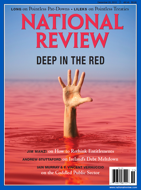
This cover, from a December, 2010 issue of National Review is a great example of the super-opinionated tone that a partisan political magazine should embody. For background information, know that National Review was founded by conservative commentator William F. Buckley Jr., longtime host of the PBS program Firing Line and a driving force behind America's conservative movement. As much as I may disagree with its politics, it is a well-respected magazine and I find this cover in particular to be very well designed.


The cover image itself is obviously the most striking part of the cover. The hand reaching out from red water, is a perfect visual metaphor for the issues theme of debt. Moreover, the way that the hand is in the center of the story titles illustrates the way the designer took great care in directing the attention of the viewer. Moreover, the idea of giving the issue a specific theme that will show through in the cover image seems like a grand idea that I will likely emulate in my portfolio project. Lastly, I think its interesting how the designer created a contrast between the red of the water and the blue tones of the border and pale horizon. This creates a patriotic color scheme that subliminally uses the age-old propaganda effect of transfer. 

The masthead is also notable, with its multi-layered bright red design, it surely stands out. Most importantly, I like how it remains in tune with the rest of the cover's color scheme, making for an altogether more aesthetically appealing design. The font itself is also very formal, which contribute to the intellectual ethos and makes it seem like quality, well-researched opinions will be found inside. 

The story titles are notable here because they all include the author. It is likely that the editors chose to do this so as to use the ethos and credentials of their authors to increase the credibility of the magazine. It is plausible that someone could purchase this magazine just to read one of the very commentator's whose name is right there on the cover. The other thing that is notable about the title lines is the opinionated language that they include. Along the top, two stories designate two different topics "pointless". Pointless is a rather strong word for mainstream journalism, and this diction is an example of a unique convention to the genre of opinion-based political commentary. If I decide to go the opinionated route, this will surely be a convention I use.

Mother Jones


Link to Mother Jones Website Where This Cover Was Found

This cover, from the March/ April 2017 issue of Mother Jones, represents the other side of the political spectrum. Mother Jones is an independent non-profit magazine with a liberal slant (as you could probably infer from the cover). Obviously, the cover is supposed to practically scream the liberal opinion even at first glance, and since I've already decided my magazine will have a similar slant, it would be a crime not to look at this stellar example.

The cover image is illustrated, although highly detailed, and includes a fair bit of humor. The president is depicted as a school bully, in elementary school striped shirt and in the process of browbeating a cowering child. While this image is also metaphorical, it is also incredibly critical. This reflects a common trope in opinion magazines: caricature of those who disagree with them. This convention features heavily in National Review covers as well, but I chose not to use one as a case study because their Obama caricatures are borderline offensive. Either way, this not a likely convention for me to emulate because, frankly, I have nowhere near the artistic ability required. Instead, I will likely use a strategy similar to that of the Atlantic and National Review covers that I have examined.  

However, I do like the way that the masthead interacts with the feature story title an the background. The yellow, white, and green all complement each other nicely, and reflect the theme of education quite effectively. Specifically, I like the way that the feature story's title is slanted and layered in front of the masthead. It reflects the informal manner of the magazine in a way that appeals to the most progressive and hippie-ish of liberals. 

The other stories featured on the cover show a decent amount of intent in the language. The mandatory pun is included in the story "West-Bling" which helps to make farce out of the subject and wraps up the magazines pointed criticism of the other side. The use of questions as the titles of the other two stories is a particularly enticing strategy for making people buy the magazine to hear the author's pinions on the issue. This convention isn't specific of opinionated magazines, but I will likely use it in my project.


The Decision

In my next post, I will have decided on the specific genre (opinionated or unbiased) and the target audience (liberal youngsters or the educated elite). Then, I will shift into more research that will help me make specific choices on conventions and design.


"William F. Buckley Jr." National Review. Garret Bewkes, 07 Nov. 2014. Web. 11 Mar. 2017.


"December 20, 2010." National Review. N.p., 01 Dec. 2010. Web. 11 Mar. 2017.

Rizga, Kristina. "Heavens to Betsy."MotherJones. N.p., Feb. 2017. Web. 11 Mar. 2017.