Tuesday, April 11, 2017
Creative Critical Reflection
Here is my Creative Critical Reflection, in the form of a screencast with a voiceover. You will notice that it is spoken very hastily. That is because when I first tried to record this, it was over eleven minutes long and I did not realize that it was recording none of the audio. So, I had to edit it down and record the voice over as I watched the screen cast, which is the reason behind some of the stalling and asynchronous cursor flailing that occurs. All the pertinent information is here however, and although it ends abruptly, it does so at exactly the 10 minute limit. Finally, you will notice that when I am nervous I revert to my native New Jersey accent. I apologize for this, but it is the product of years of upbringing among the New York and New Jersey diaspora of Florida. I hope it does not hinder understanding in any way. Also, it does correct itself around a minute before the end. This is because I had to rerecord the ending and tried my best to speak less nervously this time around. The CCR is linked below:
https://drive.google.com/open?id=0BzPIeYvc9BznZTN5aU40MTlINVU
Final Product and Revisions

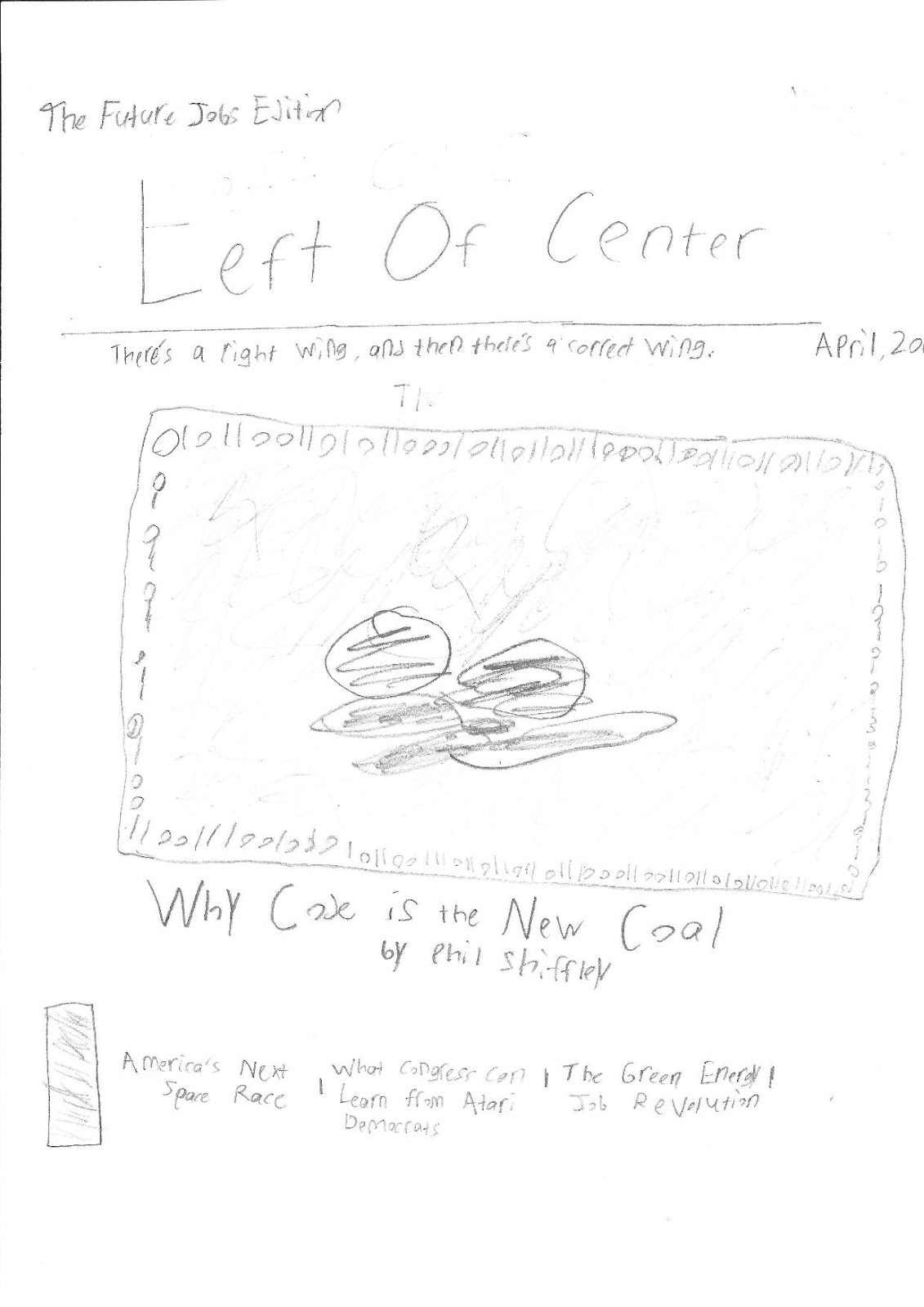
Today the portfolio project has been finalized. The major revisions that were required have also been attended to. The main concern was creating a cohesive style once all three elements of the project were incorporated together. This required standardizing certain fonts, bolding each element that was bolded on the page. For example, I forgot to bold two of the page numbers on the contents, but fixed this in post-production. The last nuts and bolts were also added. I included a bar code on the bottom left of the cover, so as to proliferate an authentic look for the magazine. Also, I added the final picture on the first page of the spread, one of my Dad as Congressman Henry Burrows. Finally, I proofread the article itself and made sure that it had the register of an educated article. All in all, I believe I accomplished my goal in creating an exciting issue whose blatant praise of one side would appeal to the partisan but educated audience I outlined in my pre-production.
I have included the finished product in image form at the top of this post, and at the bottom I have included a link to a Google Drive PDF version of the product. Unfortunately, the gray background did not save with the PDF, however all other elements remain intact.
Thursday, April 6, 2017
Another Day's Work

Ok...
Today was one of those rare days where you get so consumed by your work that you pend hours staring at a computer screen until you finish. When you get up and turn around, you realize that 4 hours have passed and it is no longer daylight outside.
Anyway, let's take a look at the work. Today I produced my two-page spread, the hardest part of the portfolio project (in my opinion). Before I start discussing the choices I made and all of that substantive discussion, I must say that the most difficult part of this whole process was getting used to the Microsoft Word formatting rules. I used the column layout tool to create the two rows of text, but this made it almost impossible to insert my sub-title image (the flag). However, I eventually got the hang of it. I'd also like to discuss what came most naturally, and that was taking the photos. I took the photos of the women learning and using code on Tuesday night, pulling out my Dad's old lighting tools from his photography days. The woman playing Ida Jameson was my Mom. The other two images that are here are graphically-produced. The flag image did not take very long at all. Of course, the graph on the second page is not accurate, and in fact almost all of the information contained in the article's text is fictitious. Still, I strove to make it read in the correct register for a magazine article. This is when my AICE English Language skills kicked in (I got an a on the exam). I used a fake name in the by-line, but I want to emphasize that I wrote the article text myself and that Jonah Sartre P.h.d. is a fictitious person. Only one element remains to be implemented, and that is my father, playing Congressman Burrows, to be inserted above the caption on the bottom right of the first page.
I decided to make the text in two columns as opposed to three because this is a text-heavy article. I definitely clung close to the minimum on the number of images, but this was because I felt that an intellectual political magazine would put more emphasis on the content text rather than visuals. Other than this, not much remains to be told about my creative process. I decided to embed the photos I had at intervals in the text that seemed equally distributed and compatible with what was being described in the text. Of course. much of the creative work done in this part of the project was coming up with ideas that could be done on Word. I think I did a pretty good job in that respect.
Finally, I will make two more posts this week. In my next post, I will provide a survey of my final product and outline any revisions that need to be made. I thankfully kept everything on one doc, so editing will take very little time. Then for my last post, I will find a way to include my final product in its full form on the blog.
Table of Contents Finished
My table of contents is completed. The final photo which I have added took longer than the others to take because it required a field trip. My dad, who works in the IT industry, took me to his office so I could photograph some high-tech things. For security reasons, I am not saying the name of the company. Also, I have applied a Glow Edges visual effect in order to blur out any serial numbers or sensitive information in the photo.

Wednesday, April 5, 2017
Table of Contents
Today I made my draft Table of Contents. It is still a work in progress, as I still have not gotten one of the pictures that I need, but it is 90% finished already. I will add the last photo later today and it will e completed. Let's take a look:


The eye is of course drawn to the central graphic. The simplistic design really highlights the partisan undertones of the magazine. The (D), representing the Democrats, is pointing upwards toward the future. Meanwhile the (R), representing the Republicans, is pointing down towards the past. The basic format of the page splits it into fourths. On the upper right and lower left quadrants are the names of the stories in bold, shadowed font. I decided to have the page numbers be in roman numerals both to increase the boldness of the design and to make it more regal. The storylines are intentionally ambiguous and or charged because this is a standard convention for a partisan magazine. The audience expects a fair amount of bias in the articles, because they know that it is bias that they share. Additionally, one can observe that the page number on the bottom also is a roman numeral. This column in the bottom margin also contains the magazine title, a helping of zeros and ones, and the issue theme title. This is a common convention to all magazines, and it will appear in my two-page spread as well. Finally, the photo that can be seen in the bottom right is supposed to represent the technology of the past. This is why it is placed next to the downward arrow. I took this picture at my Dad's workbench. He makes vintage guitar amplifiers, so there was a healthy amount of archaic circuitry just clumped around in there. I thought this was a perfect contrast to the image that I plan to place in the top left, which is a picture of an IT data room. (I have not taken this yet).
One last note, it ha come to my attention that "Stupider" is not a word. However, it appears that I have used it on one of my cover lines. I have changed this in my table of contents and it will be corrected on the cover in my final product as well.
Saturday, April 1, 2017
A Massive Waste of Time
So I wasted a lot of my own time today. As I stated earlier, I was going add a picture of coal to my magazine cover. Because I don't live next to a coal mine, I had to take landscaping rocks from my backyard. I painted the rocks black and then placed them on a white envelope under the sun. My goal was to create a large enough background of sheer white in order to use the paint splash tool and eliminate the background. I did so, however, there was still a large amount of white space in the picture. I zoomed in and painstakingly filled in the white space for an hour. After adding t to my word doc, I found that the shade of gray I used to fill in the space was slightly darker than my cover background. After playing around on Word I discovered that there is a background removing tool built in that works phenomenally. So the first two hours of producing this photo were unnecessary. I've included a process photo and the finished product in the post.


Progress Update
It is time to update you all on my progress over the past two days. I have done some more work and made some subtle changes to my cover. Here it is:


As you can see, I have added most of the elements that were missing from my last blog post. The newest editions include the two cover stories, written in partisan and inflammatory language as required, and the large graphic of green zeros and ones. I have decided to change my font as well. The font I was using before was not as regal as I had hoped it to look on smaller text, so instead, I have decided to use a font called Big Calson. This is used in all the text on the cover and will be used for the title lines and story titles in my table of contents and two-page spread. Along with the elements I have added from yesterday, I still need to add and edit the photo of the coal rocks to be placed where it has been indicated. I also need to add a barcode in the bottom left corner.
I decided to apply several effects to the text. I added a deeper shadow to the masthead and other text, because this makes it look more scholarly and bold. Also, I have decided to add a slant effect to the code block and tint it green instead of simply having a block in the center. This way, the image will be more dynamic and I can make it appear that the code is emanating from the coal rocks themselves This will better convey my message that one is leading into the other than if I had just placed the picture of coal in the middle of a block of zeros and ones.
By the end of the weekend, I hope to have completed taking the pictures of coal rocks (that seems like a pretty reachable goal) and plan the formatting for my other two elements. Because I have a limited time frame to complete them, this planning will be done directly on word rather than on paper. Also, I cannot draw, so any attempt to plan on paper will not look anything like what I'm trying to design.
Thursday, March 30, 2017
Long Week
Over the past week, my patience has been spread very thin. I've been trying to begin work on my project through Microsoft Word, however it took several updates and many more Google searches to even begin working. Still, I eventually got to work on the front page of my magazine. I am unsure how to embed it directly, so I have taken a screenshot of my current progress. Of course, there is much more to come including the other two elements, but after finally getting the program working I felt like doing some blogging.
 It looks a little plain right now, but I will add some cover lines, the barcode, the sell line, and other things to make it look busier and more filled out. The cover image is still a work in progress. I plan to begin taking pictures this weekend and edit them on Microsoft Paint. For the cover image, I plan on taking the pictures of the rocks painted black on a very high key white sheet of paper. Then, I am going to upload it to Paint and use the bucket tool to make the white background the same color as the magazine cover. I will zoom down to the pixel level if necessary in order to make it blend in. Then, I will add the zeros and ones with a text box in Word.
I decided to change the font and color so that the background could be lighter and the masthead did not have to be in all caps. Also, the Cinzel font is not available on Microsoft Word. Instead, I am using Franklin Gothic Book.

I decided to change the font and color so that the background could be lighter and the masthead did not have to be in all caps. Also, the Cinzel font is not available on Microsoft Word. Instead, I am using Franklin Gothic Book.
Sunday, March 26, 2017
Photo List
Okey-doke, so today I created a preliminary list of pictures for my magazine. Here it is:
- Coal/ Rocks Painted Black (for the cover image)
- Transistors, and other assorted electronic items in closeup piles
- Kid at a computer with American/ Chinese
- Woman interviewed learning how to code
- Man in suit who wrote a book
- Man in suit giving presentation
Besides these pictures, I will also be providing graphics such as logos and pie- charts that will be peppered into my two-page spread and produced through Microsoft Excel or Word. In order to edit the photos above, I will be using Paint, because they won't require intensive editing and I can create the effects I need, such as tinting the mirrored images of the kid at a computer desk, by creating single colored frames and lowering the transparency so that the image behind it is effectively tinted that color. I will provide an example next week once these photos have been taken. My models for a man and women that are mentioned above will be my parents, and the transistors and other technical items I will need to photograph will be from my Dad’s supply bins. He makes vintage guitar amplifiers and has plenty of scrap wires and things that can be made to look like a technical gadget. Other images that will be in my magazine will be more difficult to produce, because I do not have Photoshop or any other versatile photo-editing or graphic design program to work with. As a result, my two-page spread will likely have large sections of text to fill up space.
Layout Attempt
Today I drew a layout for my cover page. I decided to create a central cover image of a group of rocks painted black to resemble coal. I will place it on a white paper background with high key lighting. Then, I will add zeros and ones surrounding them using a word processor. I will use a grey background, and a blue border the same color as my masthead. I have decided to include my cover stories all together at the bottom by separating it into equally allotted spaces with the bar code in the far left side.
I have made these choices because they are within my range of capability. I am not a very artistic person, however, I can be creative with arts-and-crafts, and after seeing the very first example of a magazine cover (the puzzle pieces on a blue background), I realized creating a physical tableau and photographing it is an option for the cover. I chose not to include to many cover stories, because this would create a chaotic scene on the cover and distract from the cover image. Also, because it is a substantive magazine, the stories are generally longer and more detailed than in say, Cosmopolitan, so there are less of them in total. However, I will have to include some more titles in my table of contents. Later, I will be posting a list of photographs that I will need to gather in order to produce my project.
Tuesday, March 21, 2017
Headline Ideas
Today I started brainstorming some possible headlines in order to get working on my table of contents and cover. Because I’ve already decided on a theme, this was an expedited process. Some conventions that you will notice are inflammatory language and noticeable bias. This is not done to be disingenuous, but rather to fit the expectations of a partisan political magazine. This magazine will still go beyond the conventions of a one-sided magazine, because the target audience is more refined to professionals rather than youngsters or more casual followers of politics.
1.How Republicans Want to Drag Jobs into the Past, and Why Democrats Won’t Let Them
2.What Congress can Learn from the Atari Democrats
3.Coding: the New Coal
4.The New Space Race: Universal Tech Literacy
These are good examples, and one of them could easily become my cover story or two-page spread. I could easily see a spread using number 4. The story text would be about how imperative it is that we reach a level of tech literacy in which innovation jobs become as accessible to our citizens as manufacturing jobs. (The idea is to create a smarter workforce in industries that can’t be outsourced). It is a “space race” because we must do it before China. The images could include images like a computer lab in a school, two pictures of children at a computer using a mirror effect, one with a Chinese flag in the background and one with an American flag in the background. The rest could be text and images that are linked to portions of the text through the numbering system that I analyzed in the Atlantic article last week.
I also think that number 3 could make a good cover image. If I use this one, than I will have to use number 1 only in the table of contents, Because otherwise the lengthier headline (1) would distract from the central one (3).
Regardless of which I decide to use where, I am glad that I’m starting to have these ideas at all. In my next post, I will discuss my ideas for a cover layout and a list images I will need to capture in order to produce my magazine. I will also begin painting rocks black to look like coal.
Saturday, March 18, 2017
Inspiration Has Struck
I must admit, while I’ve certainly learned a lot about magazines over the past two weeks, I’ve been worried that my final product was still a hazy idea. I’ve had some basic style elements in mind, but what I knew I was lacking was an actual plan for the content of my magazine. Thankfully, I was given an idea while watching television of all things. Like I said in my analysis of the National Review cover about debt (citation and link included in an earlier post), I really liked the idea of creating an issue of my magazine with a specific theme regarding one specific political issue. While doing some research, I decided to look at what issues actually concern Americans. I took a trip to Gallup Polling and found a chart that contains some interesting data. I have included a portion of it as well as a citation and hyperlink to the website.
What Do You Think Is the Most Important Problem Facing the Country Today?
Feb 2017
|
Jan 2017
|
Dec 2016
|
Nov 2016
|
Oct 2016
|
Sep 2016
|
Aug 2016
| |
%
|
%
|
%
|
%
|
%
|
%
|
%
| |
ECONOMIC PROBLEMS (NET)
|
20
|
30
|
29
|
31
|
31
|
33
|
35
|
Economy in general
|
9
|
11
|
12
|
14
|
17
|
14
|
17
|
Unemployment/Jobs
|
6
|
8
|
9
|
9
|
6
|
11
|
8
|
Federal budget deficit/Federal debt
|
2
|
4
|
4
|
3
|
4
|
3
|
5
|
Gap between rich and poor
|
1
|
2
|
2
|
2
|
2
|
2
|
2
|
Wage issues
|
1
|
2
|
1
|
1
|
*
|
1
|
2
|
Taxes
|
*
|
1
|
1
|
1
|
1
|
*
|
1
|
Foreign trade/Trade deficit
|
*
|
*
|
*
|
*
|
*
|
*
|
1
|
Corporate corruption
|
*
|
1
|
*
|
*
|
*
|
*
|
1
|
High cost of living/Inflation
|
*
|
*
|
*
|
1
|
*
|
*
|
*
|
Fuel/Oil prices
|
*
|
*
|
*
|
*
|
--
|
*
|
*
|
Lack of money
|
--
|
3
|
1
|
1
|
1
|
1
|
2
|
Gallup, Inc. "Most Important Problem." Gallup.com. N.p., 09 Feb. 2017. Web. 18 Mar. 2017.
As you can see by this graph, a great number of Americans are worried about a vast number of economic issues. This allowed me to narrow my focus a little bit, but the real inspiration came to me while I was watching MSNBC, a political news channel, later that night. I saw an interview with Tom Perez, former U.S. secretary of labor and the chairman of the Democratic Party. While, discussing a Labor department job retraining program, he described how a large group of workers that lost their jobs in coal-mining were able to get jobs in the tech industry after taking classes in computer coding. It was then that I had the inspiration to make the theme of my magazine “Left of Center: The Future Jobs Issue”. This is a great choice, because it’s so broad a topic and would appeal to a wide variety of intellectual progressives. I could include articles about programs like this, design an illustrated cover with a tech theme (or try very, very hard to design one), and center the entire issue about how progressives’ support for training and tech research is going to save the American economy. This is an issue that very much appeals to my target audience, and there is a wealth of possible subtopics that I could include as headlines or articles in my table of contents. The possibilities are endless, and for the first time, I’m excited to begin work on this project.
Also, just as a technical note, I’ve decided to use the website joomags in order to make my magazine. I arrived at this decision after my teacher arranged for an educational license to the software. I’ve heard good things about this program, and I’m eager to begin exploring its tools as I begin planning.
The next week will be spent researching my theme and planning out the specifics of my cover and two-page spread so that I know what photographs I will need to take.
Subscribe to:
Posts (Atom)